
Heat Maps: An Engineer's Best Friend
Engineers can make pretty pictures too

In last week’s installment of Data and Discipline, we talked about how chemistry can tell a beautiful story through pictures.

Well, no disrespect to my expert chemistry colleagues, but data can tell a pretty good story itself.
Background
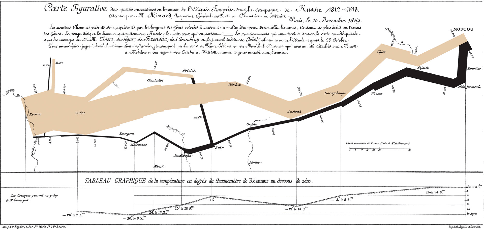
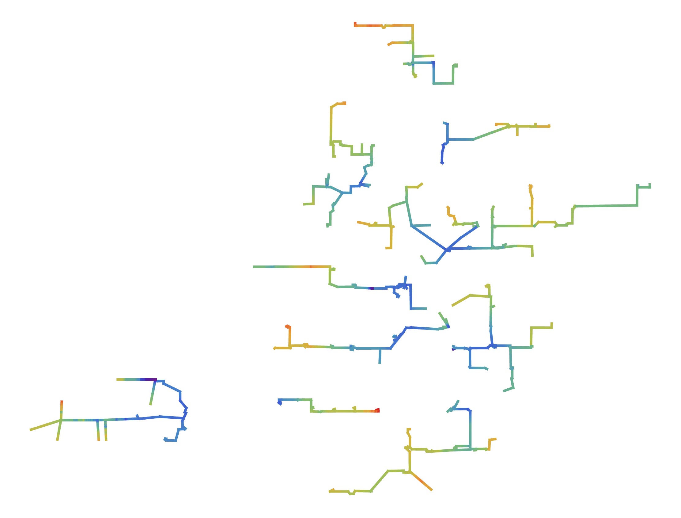
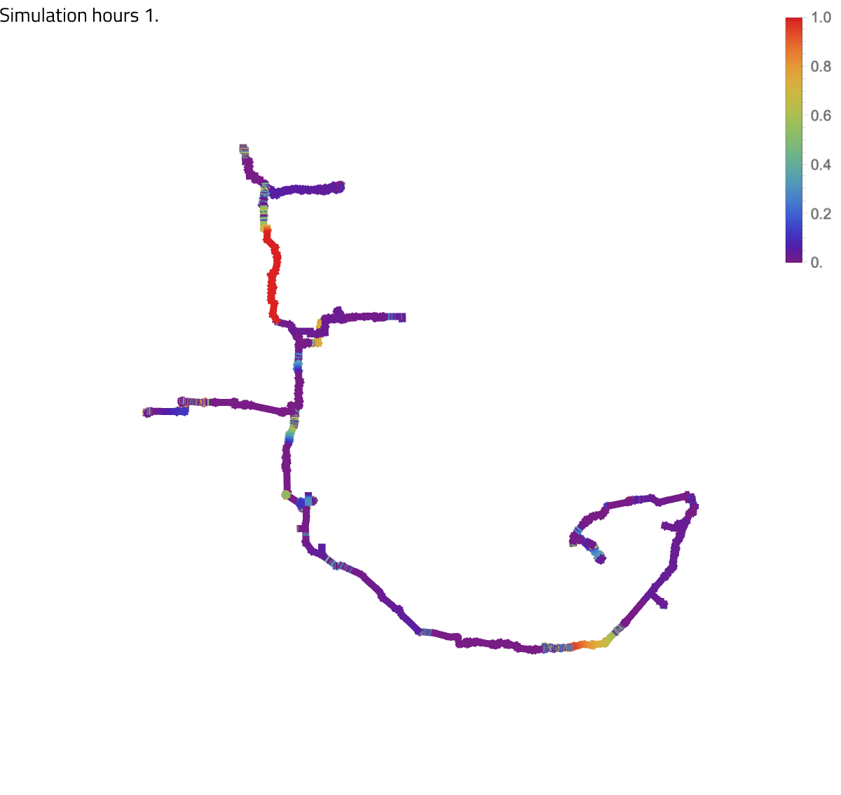
A few years ago I wrote an article on LinkedIn titled “How do you visualize complicated pipeline networks?” It was focused on discussing a new technology we had developed at the time that allowed us to take modeling results and superimpose them on to a GIS coordinates with color scales. It turned out to be an incredibly useful capability that allowed us to visualize any conditions of interest across a large network of pipelines and we naturally started referring to them as ‘heat maps’.
We got a lot of attention and appreciation for our heat maps (and still do), but working on that technology was a turning point in my understanding of the need to explain complicated things visually whenever possible.
Engineers: “I know the answer”
Back tracking just a bit, most engineers are very linear thinkers. We like to move from step 1 to step n in our heads and see everything along the way as black or white. Part of this is our personalities (there is a reason we became engineers after all), but partly it is because it is engrained in us throughout our education to give “the answer” to a problem.
In school this works just fine. You work through your homework or the problems on your test knowing that at the end, there is a correct answer and you will be graded on whether you got it right and what steps you took to get it.
Real world: “Are you sure about that?”
Then you leave school and walk into the real world….
Suddenly things aren’t quite as black and white. You don’t have all the inputs you need and what inputs you do have carry their own uncertainties. There is no way to know whether you have the right answer until the thing you are working on is built, and at that point it either works or it doesn’t.
Handling uncertainty
So how do you handle the uncertainty in the real world? Or more specifically, how do you handle the situation where “the answer” is actually “it depends”?
One of the best ways that I have found is to use visualizations as a means of explaining what *could* happen. Below is another form of a heat map, this time looking at slugging likelihood in a gas condensate pipeline that has plans to slipstream a pure oil into it. The exact rates are not always known in early design concept phases, but through this visualization, we can still begin to understand the various combinations of flow that may be problematic for liquids handling at the receiving end.

But sometimes visualizations aren’t quite as straight forward to produce. Many times it takes multiple iterations to “level-up” your visualizations taking them from Nintendo 64 to Nintendo Switch. This is where an engineer’s domain knowledge comes into play. If two or more variables can actually be described more easily by a third, that is a transformation that can make a big difference.
The heat maps below actually attempt to show the same problem, but one not only looks better, but is also easier for operations to use when looking at possibly exceeding certain guidelines for crucial operating equipment.

Telling a story
Not only do visualizations help you to explain uncertainty, but they can also begin to fill in the gaps of missing information that can lie behind “the answer”.
Did you know that umpire accuracy statistics are tracked in Major League Baseball and they typically miss strike calls at a rate of 10 to upwards of 30% in some cases? That is certainly an interesting statistic to know, but seeing the heat map below helps to understand that most of their inaccuracies come outside the strike zone horizontally, not vertically. This is actually rather surprising because the width of the strike zone never changes. Only the height of the strike zone can fluctuate, therefore most people’s intuition would be that missed calls would come above or below the strike zone.

Telling the correct story
Of course, telling a story with data isn’t always straight forward unfortunately. Data can lie to you and it can make you see things that isn’t there. This is why having the necessary skills in interpreting data is also important, but I’ll save some of those talks for another day.

Coming back to our heat map technology
Over the last few years, our heat map technology for simulation results has reached a very mature state, being able to robustly handle a wide array of potentially problematic situations (and yes, a lot can go wrong with mapping modeling results to GIS coordinates if you’re not careful).
One of the things that we are most proud of now is our technology works across multiple pieces of industry standard software including transient tools where we can see how things change not just in space, but also in time, providing crucial insights into certain operations we explore for our clients.
Final thoughts
Over the years, our GIS heat map technology has become incredibly important for us. We’ve used it to help understand bottlenecks in systems and even set up automated reporting systems for clients giving them daily “birds eye” views into changing field conditions.
But we have also used more generic heat maps to explain other complicated phenomena with equal success. And heat maps are just one kind of visualization, while there are so many more approaches depending on your problem (that we will get into in additional case studies).
At Pontem, we believe in combining domain knowledge with data to unlock the next level of insights. We do this by embracing the story the data has to tell and using it as a key component to answering the entire question we are given.