
Test Driving TabFM
Google's Foundation Model for Tabular Data

A first look at foundation models for the world’s most common data type
Background
When most people hear “AI” these days, they picture a chatbot spitting out text or a model conjuring an image from a single sentence. But the data that actually runs the world (i.e. the stuff sitting in spreadsheets, databases, and historian tags) isn’t articles or pictures. It’s tables. Rows and columns. Of all the data types out there, tabular data is far and away the most common, and it’s the bread and butter of most companies’ day-to-day work. And that’s no accident: to make data usable, we don’t just collect it, we organize it into a table, with each row a single record (a car, a well, a day of production) and each column a variable we measured (horsepower, pressure, rate). That simple grid is the standard way this kind of data gets stored and accessed, which is exactly why we call it tabular.
On June 30th, Google released a new foundational model called TabFM, built specifically for tabular data. Foundation models have completely reshaped how we work with text and images, but tables have mostly been left to the “traditional” machine learning toolkit. Naturally, the data scientist in me wanted to test drive it, first on a clean textbook dataset, and then on a real oil well’s data.
The question: Can a general-purpose foundation model really compete with the purpose-built, carefully-tuned models that data scientists normally reach for when tackling a new prediction problem?
Foundation Models: What Are They, Really?
Before getting to results, we should talk about what foundation models are.
A foundation model is a large model pre-trained on an enormous, diverse pile of data so that it develops a general “understanding” of a domain, one that can then be pointed at brand-new problems with little or no additional training. The large language models (LLMs) behind tools like ChatGPT and Claude are the most famous examples: they’re trained on massive text corpora and can then answer questions, write code, or summarize a document without being retrained for each new task. We’ve all used these tools by now.
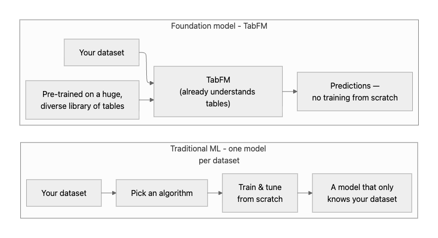
TabFM is that same idea aimed at a different target. Instead of learning the patterns of language, it’s pre-trained on a huge variety of tables, so it can walk up to a dataset it has never seen and start making predictions, often skipping the usual cycle of picking a model and tuning it.
The “traditional” way to model tabular data is to build a brand-new model for each dataset from scratch: pick an algorithm, feed it your rows, and tune it until it performs. A foundation model flips that around. It has already studied a huge, diverse library of tables, so it shows up already knowing what tabular data tends to look like, you just hand it your dataset and ask for predictions. It’s the same shift we saw with text: you don’t train a new language model every time you want to summarize a document, you just ask ChatGPT or Claude.
And while Google’s release made the headlines, it’s worth saying they weren’t first to this party. Researchers had already shown the concept worked; the crowd behind TabPFN demonstrated a couple of years back that a single pre-trained model could handle tabular prediction shockingly well. What makes Google’s entry notable is the scale it’s operating at and, frankly, the weight of the name behind it. When Google plants a flag on “the most common data type in the world,” it’s worth paying attention.
Test Drive #1: A Simple Cars Dataset
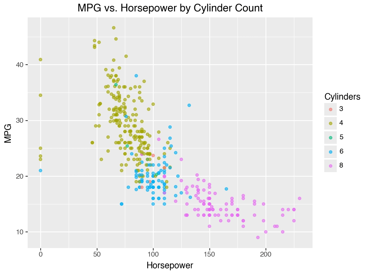
To get a feel for how TabFM behaves, I started where just about every data scientist starts: a clean, well-behaved dataset. In this case, the classic “cars” dataset, predicting a car’s fuel efficiency (MPG) from familiar characteristics like horsepower, weight, and displacement. A quick look at the data shows the relationship you’d expect: more horsepower and more cylinders, lower MPG, but there are also a few other variables in the dataset not shown below, including model year, origin (which is categorical not numerical), displacement, weight, and acceleration.
Getting set up was much easier than I expected. You load TabFM, pass in the dataset, and then ask for predictions. No training loop, no grid search, no tuning. That’s a big part of the appeal.
But before grading anything, it’s worth a quick word on how you grade a model fairly. If you let a model both learn from and get scored on the exact same data, it can essentially memorize the answers and look far better than it truly is. To guard against that, I used an 80/20 train/test split on every analysis in this post: the model learns from 80% of the rows and is then scored on the remaining 20% it has never seen. So every metric I report and every parity plot you’ll see comes from that held-out 20% test set, which is what lets us trust that the model is genuinely performing well rather than just repeating what it already saw.
To grade the results, I used RMSE (root mean squared error). If you’re not a stats person, RMSE is just a tidy way of summarizing how far off the predictions are from the actual values. Lower is better, and it’s reported in the same units as whatever you’re predicting (MPG in this case) so interpretation is easy.
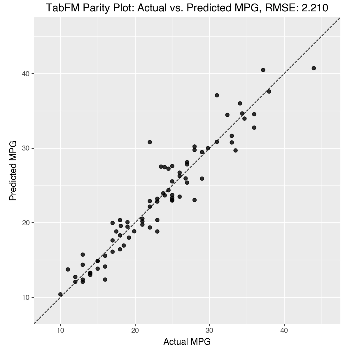
TabFM’s RMSE on the cars dataset: 2.21 MPG, and it hit that essentially out of the box, no tuning required.
I also pulled up a parity plot, which is one of my favorite quick gut-checks for a regression model. If you haven’t seen one before, the idea is simple: put the actual values on one axis and the model’s predicted values on the other, and plot one point per prediction. If the model were perfect, every point would land exactly on the 45-degree diagonal. The tighter the cloud of points hugs that diagonal, the better the model is doing. Here the points hug the line closely, with only mild scatter, which is exactly what you want to see.
Test Drive #2: A Producing Oil Well
Textbook datasets are nice, but they’re not what we actually deal with. So for a tougher test, I pointed TabFM at production data from a producing well.
The variables in this dataset, which span January 2023 until roughly January 2025 (~2 years), are:
BHP (bottomhole pressure): the pressure measured down at the bottom of the well.
THP (tubing head pressure): the pressure up at the surface where the fluids come out.
GOR (gas-oil ratio): how much gas is produced alongside each barrel of oil.
Water cut (WC): the fraction of the produced liquid stream that’s water (vs oil)..
Using measurements like these as inputs, the goal was to predict the well’s liquid production rate (Liquid_Rate).
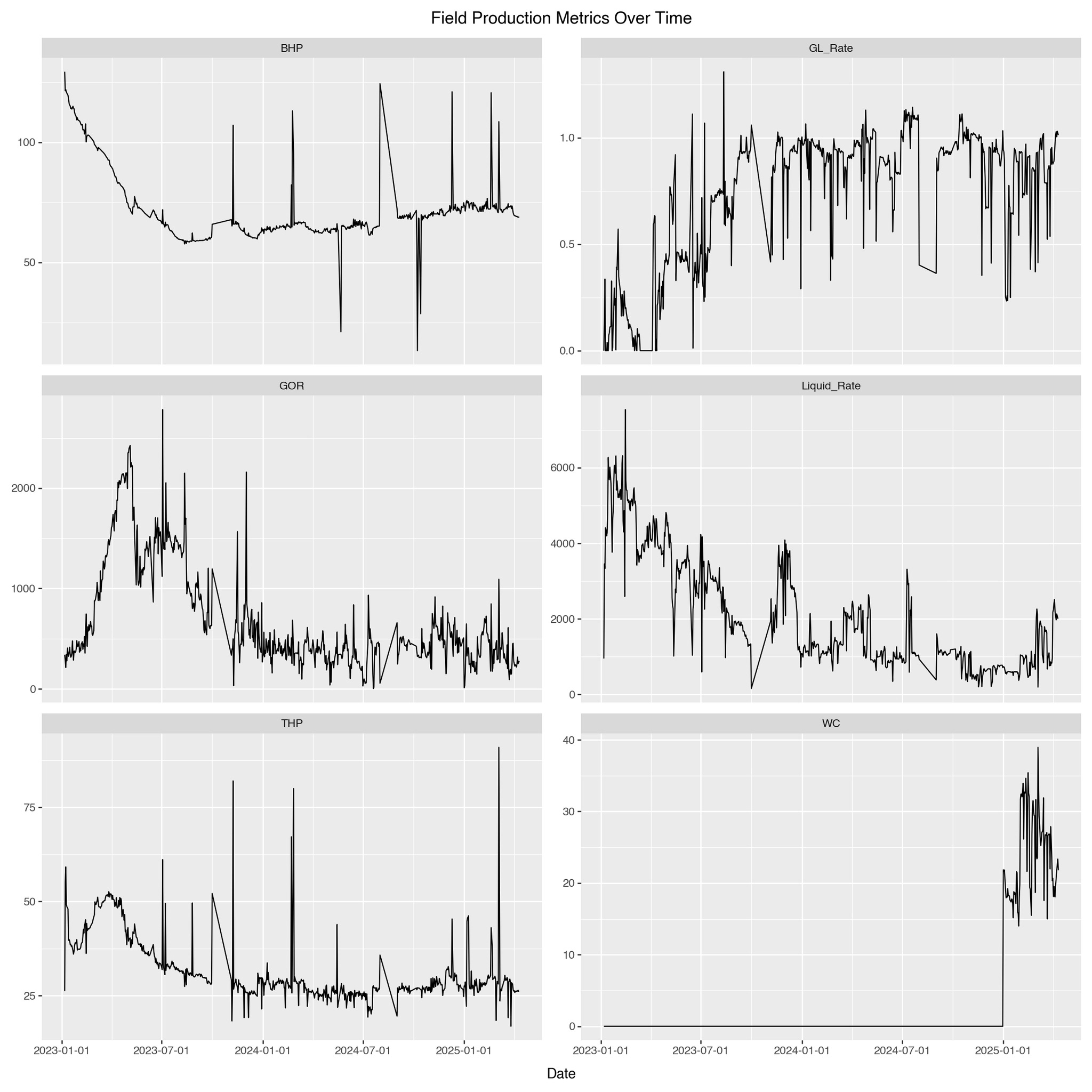
However, this well is a little messy, which you can see in the data above. Its operating conditions have changed frequently over its life, so the model isn’t looking at one steady regime, it’s looking at several. And one of the messiest variables is the water cut, which sat flat near zero for two full years and then jumped abruptly into the 20 to 40 range. Sudden regime shifts like that are exactly the kind of thing that makes models struggle. In other words, this is a proper test of TabFM, not an easy example.
To make it a fair fight, I ran TabFM head-to-head against an out-of-the-box gradient boosted model (think XGBoost or LightGBM), the workhorse most of us would reach for by default on a problem like this because they have historically been the best models for tabular data, even out performing neural networks.
The head-to-head:
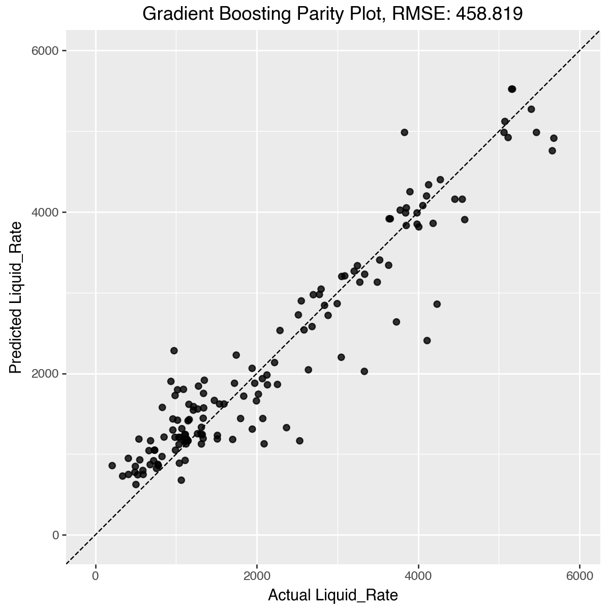
Gradient boosted (out of the box): RMSE 458.82
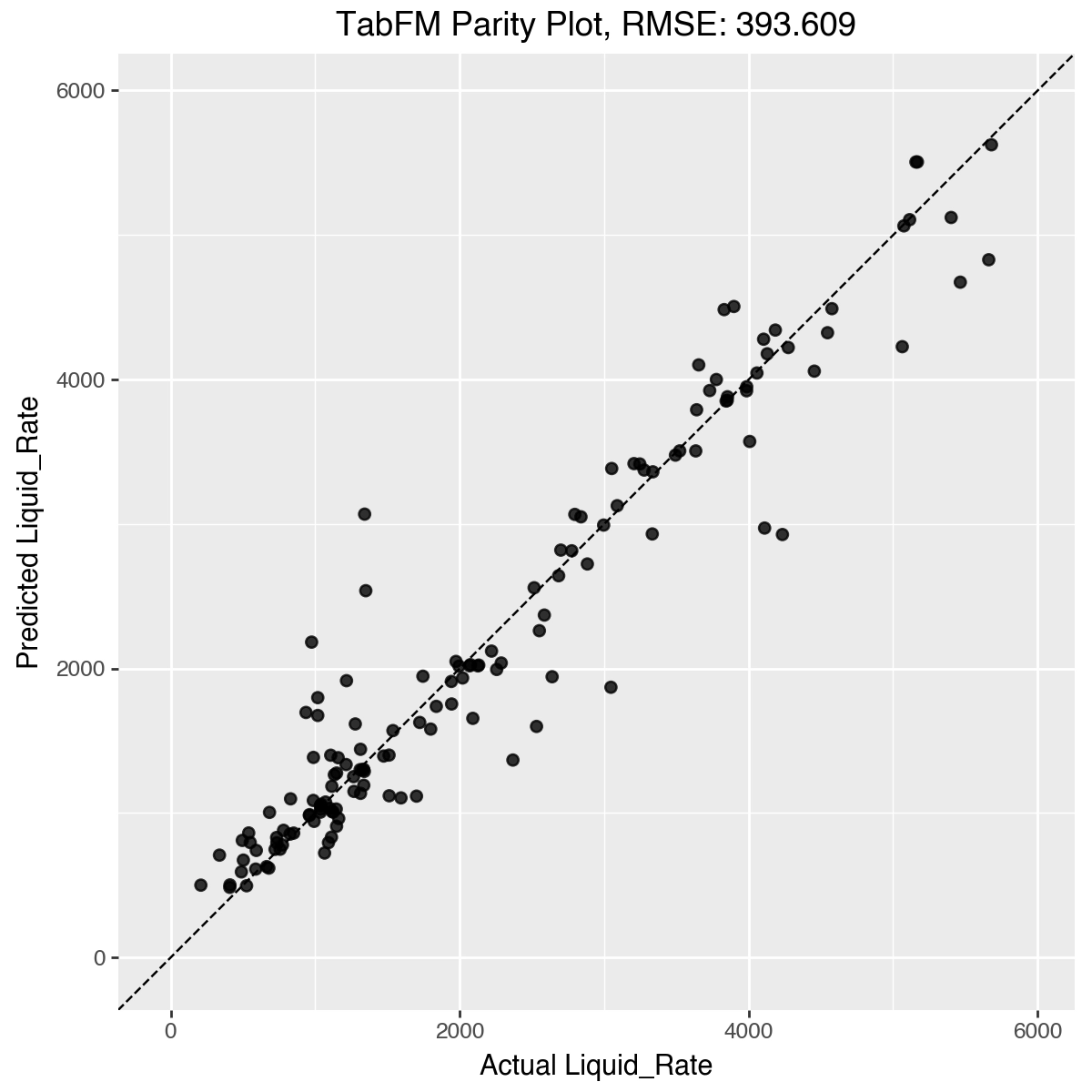
TabFM: RMSE 393.61
Winner: TabFM, by a comfortable margin (roughly 14% lower error).
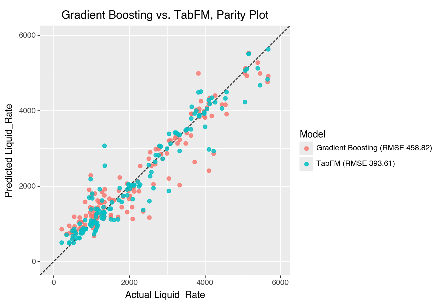
What surprised me most is that TabFM took the win without any tuning at all. Both models track the well reasonably well across most of the range, but TabFM stays tighter to the diagonal while the gradient booster scatters more, especially at the higher rates. The messy, abruptly changing behavior that I expected to trip everything up is exactly where TabFM held its edge.
For the detail-oriented, here’s each model on its own:
Wrapping Up
A few things stood out to me from this work:
Foundation models for tabular data have clearly crossed the line from “academic curiosity” to “something I’d genuinely consider reaching for.”
The out-of-the-box performance, with no model selection and no hyperparameter tuning, is the part that should make everyone in this space sit up.
Messy, real-world data (like this well) is still the true test, and it’s where these models will earn or lose their keep.
This is absolutely something to watch going forward. If a general-purpose model can match or beat a carefully chosen one on the first try, the way we approach a huge chunk of everyday modeling work starts to look pretty different.
The bottom line: TabFM is to spreadsheets and databases what ChatGPT and Claude are to text — one general-purpose model you can point at almost any table and get strong predictions from, without hand-building and tuning a custom model for each problem. So it’s not really like swapping one algorithm (say, nearest neighbors) for another; it’s closer to the jump from writing bespoke code to just asking a capable assistant. For a large share of everyday prediction work, that could mean far less model-building and tuning.
And on a more personal note, I’ll admit there’s a bittersweet element to all this. For a lot of us, hunting for the best model and painstakingly dialing in the right hyperparameters is one of the genuinely fun parts of being a data scientist. It’s the “craft”. Watching a foundation model come in and do it in one shot is both exciting, but also a little deflating at the same time.
A Note on Licensing
One final thing before I wrap up. This was a review and evaluation exercise only, not commercial use. TabFM is released under Google’s TabFM Non-Commercial License v1.0, which is expressly not intended for commercial use. Everything I did here falls squarely under what the license calls a “Non-Commercial Purpose”: testing, evaluation, and research that isn’t tied to commercial gain, production deployment, or revenue generation. None of these results were used in commercial decision-making, client deliverables, or paid products or services.